Canadian 2020 Mortality Structure Dynamics - v3.0
Main Findings Graph Explanation East West Atlantic Final Thoughts
Statistics Canada's data on excess mortality in 2020 is regularly updated and available for public to study. Here, we'll try to:
- Evaluate the completeness and quality of this data;
- Visualize mortality structure by geography and by age;
- Explore differences between provinces and age groups, if any;
- Compare excess deaths with COVID death numbers;
This is the third iteration of analysis. It improves gradually on healthy criticism and feedback, on new data sources and on corrections that critics bring in. Your feedback is always welcome!
Data Sources
Our major data source will be the following two tables:
Statistics Canada. Table 13-10-0792-01
Adjusted number of deaths, expected number of deaths and estimates of excess mortality, by week, age group and sex
https://www150.statcan.gc.ca/t1/tbl1/en/tv.action?pid=1310076801
Coronavirus disease 2019 (COVID-19): Epidemiology update
https://health-infobase.canada.ca/COVID-19/epidemiological-summary-covid-19-cases.html
Past iterations used a different data table to predict expected 2020 mortality from past years data. Different approximation methods were attempted. First iteration turned out a highly optimistic baseline estimate, resulting in overestimating excess mortality. Second iteration closely re-implemented the official baseline estimate and verified the validity of the official statistics assumptions. This third iteration parts with raw yearly data and uses the now verified expected baseline and excess mortality data from the official table.
Main Findings
Age distribution

So, we can expect that excess mortality will follow similar pattern. Or can we?

Date ranges differ from province to province, depending on data availability. For more details, see "Data ranges for provinces and geographical regions" section.
WTH? Pretty much every Canadian province shows the reverse trend! Younger ages experienced the highest percentage increase, older people - significantly less!
Those are percents, of course - absolute numbers should look less scary. Vast majority of all deaths are old people, not young, after all. So, even a very large percentage increase in the "young" group applies to a very small total numbers. And vise versa - even a tiny percentage increase for older people should produce much larger totals. We saw exactly that in the first iteration. Now that we know that first iteration was overestimating excess deaths in older population, we've adjusted the baselines - but the general expectation should still hold. Does it?

Date ranges differ from province to province, depending on data availability. For more details, see "Data ranges for provinces and geographical regions" section.
Ugh! For some reason, only Quebec looks "as expected" - with reasonably smooth spread across age groups, closely following our first logarithmic image. In the other provinces, large youth mortality increase remains high even in the absolute numbers!
Youth Mortality
That's not as strange as it may seem. Yes, since the first iteration, we've got more refined data and more accurate methodology. But this methodology improved accuracy only for older ages. For younger ages, our very first methodology was already as good as the new one. This is why our major finding - the unproportional youth mortality - does not look any better. In fact, with decreased share of elderly mortality, it now looks worse!
Another thing not changing over time - the ignorance. We still don't know what kills the young people. No data on causes of deaths, so we can only guess... and look asome other regional stats. Drug overdoses? Part of it for sure! (Calgary Herald: Opioid Deaths in ALberta) Depression and suicide? Does not look like it... at least not yet. (CTV News: Suicides Trends Down) Gang violence? Accidents from new trades and hobbies instead of restricted ones? Road accidents? Not COVID: young people are the least affected by virus directly, with each such fatality (even a mistaken one!) getting special news coverage... [https://globalnews.ca/news/7326819/alberta-coronavirus-covid-19-september-10/]
In another upsetting observation, these ages are expected to be most affected - in a positive way - by "excess survivability" effect. Pandemic has removed many "traditional" causes of (mostly accidental) deaths among younger people - so there should have been fewer young deaths, not more!
Incidentally, a very similar research of the excess mortality in the USA (https://www.cdc.gov/mmwr/volumes/69/wr/mm6942e2.htm) also shows new disproportional mortality in younger people - so this is not something Canadian-specific. It seems that younger people are indeed not immune from the deadly dangers of the pandemic - but not in a way one would think of...
Elderly Mortality
Sharp reduction of elderly mortailty is another puzzling effect after youth mortality rize. With adjusted baselines, this drop is expected - but not to such extent. Even all-Canada excess elderly mortailty is not impressive, and in many jurisdictions it hovers at mere percents, occasionally going below zero. Yes - in some places excess mortailty is negative in the older age groups!
One possible explanation comes to mind. When any COVID deaths are announced, we subconsciously imply that all these people would have still been alive, if not for the virus. But this is very much not the case! Vast majority of direct virus fatalities occur in the same age groups that are already dying out - actvely and naturally, mostly from simply "being old". Low or negative excess numbers show that in such places majority of COVID-caused deaths are not "premature": if not for COVID, those same people would have likely die within 2020 anyway.
Regional Diversity
Another major finding is the significant regional diversity across Canada. Divides in demography, economy and lifestyles between provinces and regions are so deep, that they should be compared with much care. The graphs above show, that, of all provinces, only Ontario resembles the cumulative Canadian data close enough to be useful. If you live anywhere else - forget any all-Canadian stats and use your local numbers and situations. Not only numbers vary across Canada - the very date ranges to which data is applied can be different!
Canada's slow and archaic data collecting system is further impended by provinces. You'll often see graphs like this one - weekly plot of all excess deaths extracted from the all-Canada table:

However, a deeper look reveals that the data, on which this plot bases, is not uniform across provinces, and misses some important elements. This is how data looks mid-February 2021:
- Alberta, British Columbia and Newfoundland data is good up to and including November;
- Manitoba, Saskatchewan and Nova Scotia data is good up to and including October;
- Ontario data (which is the biggest chunk of data here) is good up to and including September;
- Quebec data is generally good for the full year - except for the most intriguing 0-44 age group which completely stops after week 35 in August (!)
- Yukon data is missing for full three past years, impossible to calculate baseline;
We don't really look at smaller provinces (except for Yukon which "jumped out" by completely failing data verification). Remember of these limitations next time you see a diagram like this! They do not invalidate data, but remind us that Canadian statistics is not only painfully late, but also non-uniformly late.
Graph Explanation
Now let's look at different provinces, starting East to West, and skipping really small "bubble" provinces. Here is a breakdown of what the values are in the diagrams below:
- Age - age strata is taken "as-is" from the source data. For estimated COVID allocation, ages 65-84 and 85+ are joined together.
- # - number of excess deaths, taken "as-is" from the source data.
- % - calculated percentage of actual deaths number increase over expected baseline.
- COVID - number of COVID-caused deaths. Total number is taken "as-is" from the source data. Allocations between age groups are calculated in approximate logarithmic proportion. Because of a rougher approximation, numbers are rounded to second digit before decimal.
- Other - number of non-COVID-caused excess deaths, calculated by subtracting COVID deaths from total excess deaths and rounded to second digit before decimal. Can be negative.
- Ratio - calculated excess non-COVID to COVID mortality ratio. Can be negative.
For smoother look, each data point combines together four weeks.
Provinces - East
Quebec
As explained earlier, we have to truncate Quebec data after August due to missing numbers on 0-44 age group - making it the shortest date range among provinces:

Quebec is unique in many ways. More than one feature in its diagram is not seen anywhere else:
- percentage of mortalitity increase in more or less the same in every age group;
- percentage is highest in the oldest (85+) age group, yet non-COVID to COVID ratio is notably negative, meaning no collateral deaths;
- no signficant non-COVID excess mortality in any group, even though ratio in younger strata is still higher than desirable;
Ontario
Ontario data go for a whole month longer than Quebec:
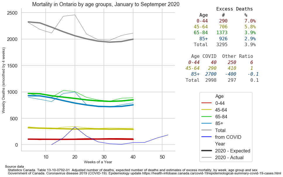
In the first check, Ontario data was repeating All-Canadian data in such close resemblance, that it is tempting to plot the whole Canada next to it and compare. Of course, all-Canadian plot must be limited to August, otherwise incomplete Quebec data will invalidate its trailing section:

Indeed, close enough! If you forget absolute numbers and look at more "generic" percentages and ratios - the plots and tables are almost twins!
What is not pleasant about this graph - after a rather ideal Quebec - is a gradual increase of mortality percentage from older to younger groups. Also, youth mortality increase, while being highest among other groups, looks quite modest with only 6:1 non-COVID to COVID ratio.
Canadian ratios look a bit worse, of course, likely due to Western influence.
Provinces - West
First, let's look at all four western provinces joined together:

"Combined West" looks very different from both the "whole Canada" and any Eastern province in particular:
- no negative ratios - non-COVID excess mortality is present for all ages;
- non-COVID and COVID excess mortalities are about equal for older population;
- non-COVID to COVID ratios and percentages look really scary for the youngest strata!
Manitoba
Good Manitoba data goes to the end of October:
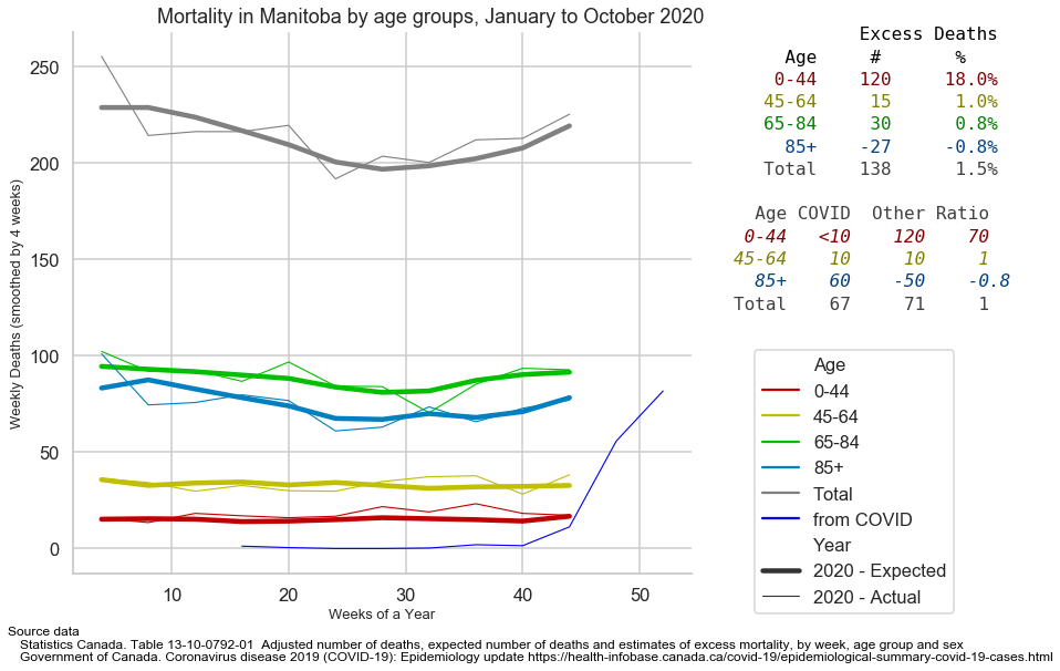
Absolute numbers of excess mortality in Manitoba are not that big to make statistically significant predictions. But even with these numbers you can see that almost all excess fatalities were younger people dying "from other reasons". That does not look good at all!
Saskatchewan
Good Saskatchewan data also goes to the end of October:

Like in Manitoba, Saskatchewan's excess deaths are almost exclusively collateral. Unlike in Manitoba (and unlike anywhere else) their weight is unproportionally shifted from younger people to middle-aged group. Those are absolute numbers - percentage-wise and rate-wise, younger group is, unfortunately, the absolute leader, like everywhere.
Alberta
Good Alberta data goes to the end of November:

Uniquely for Alberta, the youngest strata had suffered most in every single aspect - absolute numbers, percentages and ratios altogether. More than in any other province! No wonder so many young people are so unhappy here!
Excess mortality in the oldest strata is bigger than in the east - but not by much. Same as everywhere else: people killed by COVID in these ages would have been dead anyway - from natural causes.
British Columbia
Good British Columbia data goes to the end of November:

BC picture is generally similar to Alberta. Only so slightly less horrible for youth strata, just a little worse for older ages. Between them, it is easy to miss a bigger non-COVID hit to the middle-age strata... but it is there. In general, COVID mortality is fully covered by expected baseline, so non-COVID share is prominent in every age group.
Atlantic Provinces
As a bonus, let's have a quick look at two Atlantic provinces - Newfoundland and Nova Scotia. They are both too small for any meaningful detailed stats, but maybe we can spot some differences ant least in the trends:


| Nova Scotia | Newfoundland |
|
|
Final Thoughts
It is hard to add anything to the numbers and graphs - they speak for themselves, and their story is a sad one. Just a few findings are worth reiterating.
The best finding is that the virus is much less deadly than many scared people still presume. At the same time, it is a little more deadly than "other many people" think. This study does not address the question "are COVID-fighting measures killing more people than they are saving?" - because we don't know how many we are saving.
This study answers a different question: "are COVID-fighting measures currently killing more people than COVID itself?" And the answer depends on where you live and what ages you consider.
For numbers for all ages in big Eastern provinces do not show any non-COVID collateral damage. "Combined West" reveals collateral deaths at 3:1 ratio.
In different age groups, things are much more diverse. Younger people face unusually high collateral mortality increase even in the East. This effect is hidden when data is reported for all age groups. In the West, the growth in the youth mortality is so staggering it shows even in the overall numbers!
Older people, on the other hand, often do not see the excess mortality at all - COVID deaths simply replacing natural causes. And where there is excess elderly mortality, it is seldom accompanied by collateral side effects - West being a sad exception once again...
This study highlights the drawbacks and really unacceptable time lags and quality gaps in Canadian statistics collection, especially compared to other countries!
This study verified the expected divide between East and West. While East had been harder hit by the actual virus, West suffered a lot more from the collateral chaos.
What can be done about all this? Not much. It will take something more drastic than a couple of long-suspected revelations to change anything in the pandemic response. Governments already played every card in their sleeve, and all we can expect are the various combinations of repeating the same - each time with more desperation.
But with all this available data coming, we should at least study, study and more study - every bit of it. If you can see the problem that others can't - you may be able to at least better plot your own personal path through the muddy waters.


